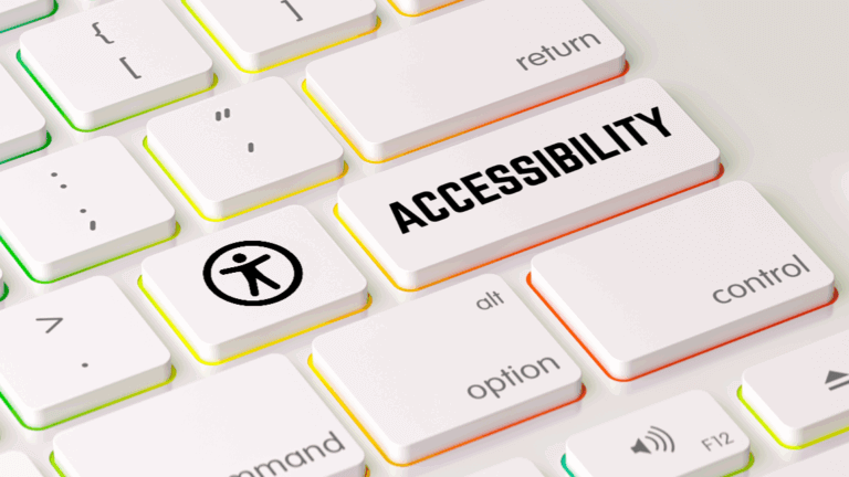
Real Accessibility Means Getting the Basics Right
This week, the WordPress accessibility community gathers for the annual WordPress Accessibility Day virtual conference—the most important yearly event for WordPress accessibility professionals and advocates. With sessions spanning everything from design patterns to testing methodologies, it’s where the community comes together to advance the state of accessibility in WordPress.
One session stood out for its practical, immediately actionable insights: “Accessible Design Patterns for 2025” by Vitaly Friedman , UX lead at the European Parliament and co-founder of Smashing Magazine.
What Makes This Session Important
Friedman opened with a provocative observation: despite 25 years of accessibility articles, tools, and techniques, we’re still struggling to make accessibility a priority. Why? Because accessibility is still too often perceived as a compliance checklist rather than what it truly is—a dedicated effort to keep digital experiences meaningful and usable for as many people as possible.
The problem with compliance-first thinking? Organizations do just enough to meet guidelines, then stop. Real accessibility doesn’t work in sprints followed by silence. It must be intentional, designed, and maintained continuously.
The Patterns That Matter Most
Rather than overwhelming teams with extensive guidelines, Friedman focused on patterns where getting the basics right makes the biggest impact:
Hidden, Disabled, and Read-Only States
One of the most expensive mistakes in interface design? Disabled buttons. Users frequently get stuck not knowing how to make a disabled button enabled. The solution isn’t always obvious—especially with form validation errors that block progress without clear recovery paths.
Friedman’s decision framework helps teams choose the right state:
- If users can never interact with it → Hide it
- If it’s primarily informational → Make it read-only
- If it prevents critical mistakes → Consider keeping it enabled and showing errors on interaction instead
Navigation That Actually Works
Mega dropdown menus remain prevalent despite their accessibility challenges. The classic problem: hover over a submenu, accidentally cross the wrong boundary, and start over. Repeatedly.
The solution has existed since the early 2000s—Amazon’s triangle pattern, where the system maintains content visibility as long as users navigate within a triangular zone connecting their cursor to the target area. Yet many sites still get this wrong, creating frustration for keyboard users, mobile users, and anyone with motor control challenges.
Motion That Doesn’t Cause Harm
Around 30% of people are susceptible to motion sickness triggered by mismatches between what they perceive and what they feel. Friedman emphasized: accessible motion doesn’t mean no motion—it means respecting physics, mapping scrolling to animations naturally, avoiding flashing images, and most importantly, giving users control.
Color That Actually Communicates
While colorblindness affects 300 million people globally, Friedman noted that solutions go beyond just color choice. Effective approaches include:
- Using shapes and textures alongside color
- Providing toggle options for different visual modes
- Ensuring any two colors vary significantly by lightness
- Making data available in alternative formats (tables, lists, summaries)
Why This Matters to the WordPress Community
Here’s what resonated most: People aren’t edge cases. They’re people. There is no “average user” with standardized abilities. Everyone exists somewhere on a spectrum of permanent, temporary, and situational disabilities.
Friedman reminded us that many universal conveniences we rely on—subtitles, SMS, eyeglasses—originated as accessibility features. Accessibility isn’t just better for people with disabilities; it’s better for everyone.
The Real Work Ahead
The session reinforced something we believe deeply at Insi: accessibility should not be bolted on when you’re done—it’s something you start with and risk losing with every change.
Getting the basics right means:
- Designing for keyboard navigation from the start
- Using proper ARIA attributes and semantic HTML
- Testing with actual assistive technologies
- Understanding that compliance checkboxes ≠ accessible experiences
- Building accessibility practices into your workflow, not treating it as a one-time audit
As Friedman put it: “Very often you can gain a lot of wins, quick wins, by doing things that are just simpler and maybe slightly more boring.” Fast, legible text. Large checkboxes that look like checkboxes. Predictable tab navigation. Helpful error messages. Simple, clear, functional design.